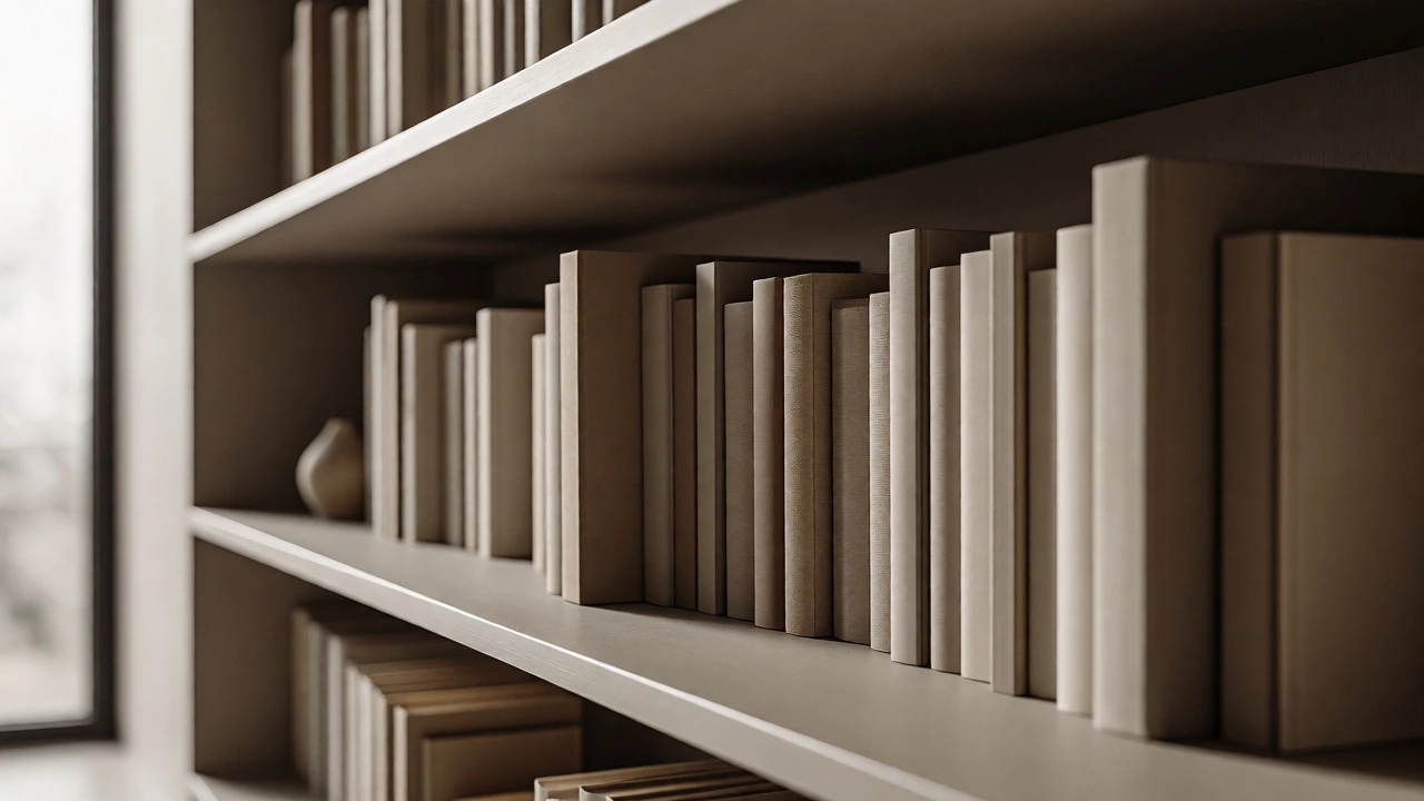
Interactive Shelf Styler
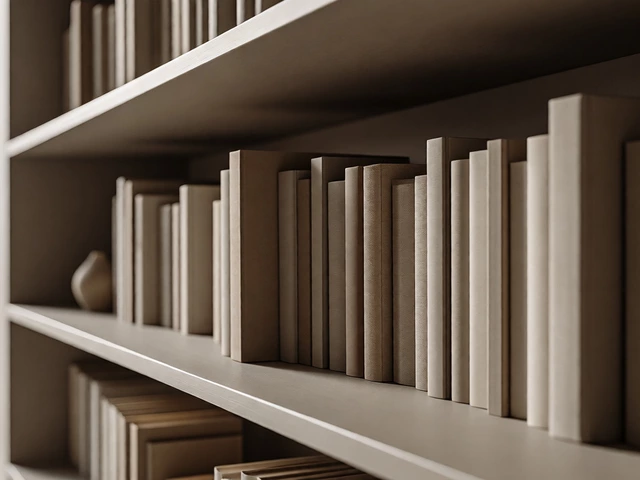
Adjust the slider to see how turning books around (covers facing in) reduces "visual noise" and creates a cleaner, more cohesive look by prioritizing color over text.
You walk into a high-end showroom or flip through a glossy magazine spread, and something feels off. The books on the shelves look wrong. The spines are facing the wall, hiding the titles behind their covers. Is it laziness? A mistake? Or some obscure rule of interior design that you missed?
It’s not a mistake. It’s a deliberate choice. When designers place books backwards, they aren't trying to confuse you. They are manipulating visual weight, color balance, and texture to make a room feel more cohesive. If you’ve ever wondered why your own shelves look cluttered while a styled one looks calm, this trick might be the missing piece.
The Visual Noise Problem
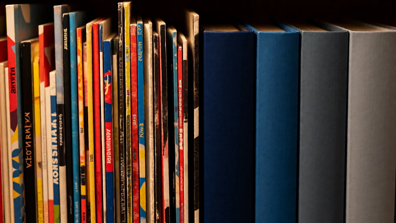
Think about the last time you looked at a densely packed bookshelf. What did you see? You saw thousands of tiny rectangles of varying colors, fonts, and logos. For the human eye, text is complex. Our brains try to read every title, note every author, and process every publisher logo. This creates what designers call "visual noise."
When a shelf is full of colorful spines, it competes with other elements in the room. If your walls are neutral, your sofa is beige, and your rug is grey, a rainbow of book spines screams for attention. By turning the books around, you strip away the text. You replace chaotic typography with uniform blocks of color. Suddenly, the bookcase stops being a library catalog and starts acting like a textured backdrop.
| Attribute | Facing Out (Spines) | Facing In (Covers) |
|---|---|---|
| Visual Complexity | High (Text, Logos, Varied Fonts) | Low (Solid Colors, Uniform Patterns) |
| Color Control | Random (Depends on book content) | Curated (Matches room palette) |
| Perceived Order | Cluttered if mixed sizes | Clean and architectural |
| Accessibility | Easy to find specific titles | Harder to browse quickly |
Controlling Color and Texture
Most people don’t buy books based on how well their covers match their living room curtains. We buy them because we want to read them. That means your collection likely contains a jarring mix of neon yellow thrillers, stark white academic texts, and dark blue novels. When these sit side-by-side, the clash can ruin a carefully chosen color scheme.
Turning books around allows you to group by cover color rather than title. You can create a gradient effect-moving from deep blues on the left to soft creams on the right. This turns a random assortment of paperbacks into a custom-made art installation. It’s especially effective in modern minimalist spaces where clean lines and muted tones are paramount. Instead of seeing "Stephen King" and "Jane Austen," you see a soothing wave of navy and slate.
Texture plays a role here too. Hardcover books have cloth or leather bindings that offer a tactile richness paperbacks lack. Facing them inward lets the texture of the binding dominate over the gloss of a dust jacket. This adds depth to the shelf without adding visual clutter.
When to Use the Backwards Trick
This technique isn’t universal. It works best in specific scenarios. If you’re designing a space for relaxation, like a bedroom or a cozy reading nook, minimizing visual stress is key. Backwards books help achieve that zen vibe. They suggest abundance without demanding attention.
However, there are times when you should keep those spines out:
- Functional Libraries: If you actually use the books regularly, hiding the titles defeats the purpose. You need to grab that cookbook or reference manual quickly.
- Statement Collections: If you own first editions or beautifully illustrated art books, show them off. The spine itself is part of the aesthetic value.
- Kids’ Rooms: Children often recognize books by their colorful covers and familiar characters. Hiding them makes the room feel less inviting for young readers.
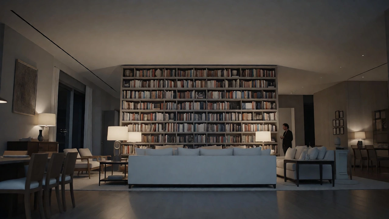
In my experience working with clients in Mississauga who love the "Instagram look," the backwards method is often used in open-plan living areas. These spaces are viewed from multiple angles. From a distance, a wall of backward books reads as a solid block of color, which helps anchor the furniture layout. Up close, guests can still turn a few books forward to browse, but the overall impression remains calm.
How to Style Your Shelves Like a Pro
If you want to try this hack, don’t just blindly rotate every book. Here is a practical approach to getting it right:
- Purge First: Remove any books with tattered covers or ugly designs. Only keep books with covers you actually like looking at.
- Sort by Hue: Group your books by dominant cover color. You’ll be surprised how many "random" books actually fall into a limited palette of blacks, whites, greys, and browns.
- Mix Orientations: Don’t make every single book face backward. Keep 10-20% facing out to break up the monotony. This prevents the shelf from looking like a warehouse stockroom.
- Add Objects: Intersperse small vases, sculptures, or plants among the books. These objects provide focal points that draw the eye away from the repetitive pattern of the covers.
Consider the height of your shelves. Taller shelves benefit more from the backwards trick because the eye scans horizontally across large spans. Shorter, cubby-style shelves can handle more variety since each section is isolated.
The Psychology Behind the Trend
Why does this trend persist? It taps into our desire for order in a chaotic world. Modern life is information-heavy. We are bombarded with notifications, headlines, and ads. Coming home to a space that doesn’t demand reading feels restorative. The bookcase becomes a symbol of knowledge without the cognitive load of processing it.
It also signals status subtly. A perfectly aligned row of identical-colored spines implies effort and curation. It says, "I care about aesthetics," even if the person hasn’t opened a book in months. It’s a form of decorative shorthand that communicates taste without words.
Of course, purists hate it. Librarians cringe. But interior design is about how a space makes you feel, not just how it functions. If turning books around makes your living room feel calmer and more put-together, it’s worth the experiment.
Alternatives to Turning Books Around
If the backwards method feels too fake for your style, there are other ways to reduce visual noise:
- Horizontal Stacking: Stack some books flat. This breaks up the vertical rhythm of spines and creates natural pedestals for small objects.
- Use Neutral Dust Jackets: Wrap unattractive books in plain kraft paper or fabric. This achieves the same color control as turning them around but keeps the orientation standard.
- Leave Gaps: Empty space is powerful. Pulling books apart slightly or leaving whole sections empty gives the eye a place to rest.
Ultimately, the goal is harmony. Whether you hide the spines or highlight them, ensure the result supports the mood of the room. If your shelves feel loud, quiet them down. If they feel boring, add contrast. The backwards book trick is just one tool in the box, but it’s an incredibly effective one for creating instant visual peace.
Does putting books backwards damage them?
No, placing books with their covers facing outward does not damage them any more than normal shelving does. However, ensure they are supported properly so they don't lean excessively, which could warp the spine over time. Just remember to pull them out gently when you want to read them.
Is it hard to find books if they are backwards?
Yes, it requires more effort. You have to scan the covers instead of the titles. To mitigate this, many people keep frequently used books facing out and only style rarely accessed decorative books backwards. Another tip is to leave a small gap between groups of books to make browsing easier.
Should I turn all my books backwards?
Rarely. A mix is usually best. Designers typically recommend keeping about 80% of the books facing inward to create a unified color block, while leaving 20% facing outward to add interest and functionality. This balance prevents the shelf from looking too sterile or artificial.
What kind of books work best for this style?
Hardcovers with simple, elegant covers work best. Avoid books with busy graphics, bright neon colors, or damaged jackets. Solid-colored bindings or those with subtle patterns blend seamlessly into a curated look. Paperback collections can also work if sorted strictly by color.
Does this trend apply to digital libraries too?
Interestingly, yes. Many e-reader users organize their digital libraries by cover color for a similar aesthetic effect on screens. While you can't physically turn them, sorting apps allow you to view your collection as a grid of covers, letting you curate a visually pleasing digital bookshelf.