Have you ever looked at a perfectly styled bookshelf in a magazine and thought, "How did they do that?" It looks effortless, curated, and balanced. Now look at your own shelves. Maybe they’re chaotic, maybe they’re too empty, or maybe every single item is lined up like soldiers in a row. The difference usually comes down to one thing: understanding the bookshelf rule.
The bookshelf rule isn’t a strict law enforced by interior designers. It’s more of a guiding principle-a set of visual habits that make storage furniture look intentional rather than accidental. Whether you have a towering floor-to-ceiling unit or a small floating shelf above your desk, applying these rules can transform clutter into character.
The 70/30 Rule: Balancing Books and Decor
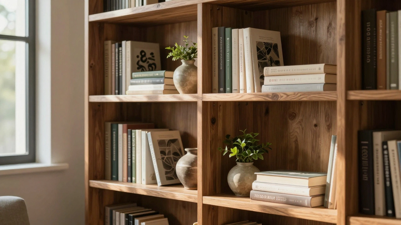
If there is one golden ratio in shelf styling, it is the 70/30 rule. This concept suggests that 70% of your shelf space should be dedicated to books (or vertical items), while the remaining 30% should be reserved for decorative objects, plants, or personal mementos.
Why does this work? Books provide structure. They are uniform, vertical, and predictable. Without them, a shelf can feel floaty and unstable visually. However, if you fill every inch with books, the shelf becomes a library archive-functional but boring. The 30% break allows your eye to rest and gives you space to tell a story through objects.
To apply this, start by filling your shelves with books until they feel about three-quarters full. Then, pull out a few volumes to create negative space. Use those gaps to place a vase, a framed photo, or a small sculpture. If you don’t have enough books, use decorative boxes or stacked trays to mimic the height and weight of a book stack.
Vertical vs. Horizontal: Breaking the Monotony
One of the biggest mistakes people make is lining up every book vertically. While this saves space, it creates a visual wall that is hard to process. The human eye loves variety. Mixing vertical stacks with horizontal piles adds rhythm and depth to your display.
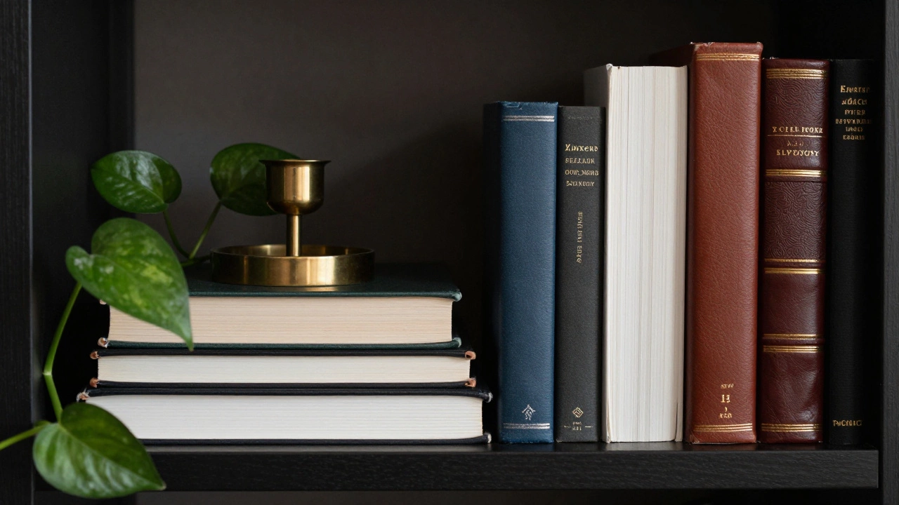
Try stacking three to five books horizontally on top of each other. Place a small object on top of the stack-like a candle, a small plant, or a figurine. This creates a "pedestal" effect, elevating smaller items so they aren’t lost against the background. Just remember to keep the horizontal stacks relatively low; if they get too tall, they might tip over or block the view of items behind them.
You can also mix orientations within a single group. Stand two books up, then lay three flat in front of them. This simple change breaks the rigid grid and makes the arrangement feel more organic and lived-in.
The Power of Negative Space
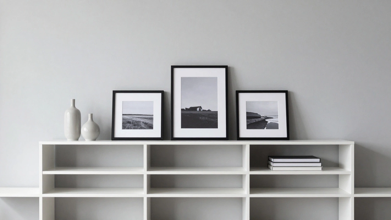
In interior design, negative space is just as important as the objects themselves. Cramped shelves scream "storage," while shelves with breathing room whisper "style." Don’t feel pressured to fill every nook and cranny. Leaving some areas empty helps highlight the pieces you do want to showcase.
Think of negative space as the frame around a painting. Without the matting, the artwork blends into the wall. Similarly, without empty space, your decor blends into a mess. Aim for at least 10-15% of your total shelf surface to remain completely clear. This doesn’t mean leaving entire shelves bare unless you’re going for a minimalist industrial look. Instead, distribute the emptiness evenly so no single area feels overcrowded.
If you struggle with empty spaces because you’re worried about dust accumulation, consider using closed cabinets for lower shelves and open shelving only for eye-level displays. This way, you maintain the airy aesthetic where it matters most while hiding clutter below.
Color Coordination and Grouping
A rainbow of book spines can look vibrant, but it can also look chaotic if not managed correctly. You don’t need to organize your books by color like in a bookstore-that often looks sterile and impersonal. Instead, try grouping similar colors together in clusters.
Pick a dominant color palette for your room-perhaps warm earth tones or cool grays-and arrange your books to complement it. If you have a lot of white-spined books, group them together to create a clean, bright block. If you have leather-bound classics, cluster them to add texture and richness. Introduce accent colors sparingly using your decorative objects. A bright yellow vase can pop beautifully against a backdrop of neutral-toned books.
Don’t forget about texture. Mix matte finishes with glossy ones, smooth paperbacks with rough cloth bindings. Textural contrast adds sophistication even when the colors are monochromatic. A woven basket placed next to sleek glass jars creates a tactile interest that draws people in.
Varying Heights and Sizes
Uniformity is the enemy of visual interest. If every item on your shelf is the same height, the line across the shelf becomes flat and unengaging. Varying heights creates a skyline effect, leading the eye from left to right and back again.
Use tall vases or standing sculptures to anchor one side of the shelf. Balance this with shorter, wider items on the other side. In the middle, use medium-height objects or stacked books to bridge the gap. This triangular composition is a classic art technique that ensures stability and balance.
If you have a particularly large item, such as a oversized piece of art or a big planter, place it slightly off-center rather than dead center. Centering large objects can make the display feel static and formal. Off-center placement feels more dynamic and casual.
| Mistake | Why It Fails | The Fix |
|---|---|---|
| Filling every inch | Looks cluttered and stressful | Apply the 70/30 rule; leave 10-15% negative space |
| All vertical books | Creates a visual wall | Stack 3-5 books horizontally; place decor on top |
| Random small items | Lacks focus and cohesion | Group items in odd numbers (3s or 5s) |
| Ignoring depth | Items look flat and 2D | Place some items forward, others back to create layers |
| Matching everything perfectly | Looks staged and unnatural | Mix textures, eras, and styles for personality |
The Odd Number Rule
When arranging groups of objects, always aim for odd numbers. Three candles look better than two. Five books stacked look better than four. This is a psychological quirk of human vision; our brains find odd-numbered groups more interesting and easier to process because there is a clear focal point-the middle item.
Even numbers tend to split attention equally between two sides, which can feel static. Odd numbers create a hierarchy. The central item becomes the hero, while the flanking items support it. Apply this to your decorative objects, not just your books. If you have a collection of coasters or small figurines, display them in threes or fives rather than pairs.
Personalizing Your Display
Rules are meant to be guidelines, not constraints. The best bookshelves reflect the owner’s personality. Include items that have meaning to you: travel souvenirs, children’s drawings, vintage cameras, or inherited jewelry boxes. These pieces add narrative value that generic decor cannot match.
Rotate your displays seasonally. Swap out heavy winter textiles for light summer ceramics. Change the flowers based on what’s in bloom. This keeps your home feeling fresh and alive without requiring new purchases. It also prevents you from getting bored with the same view day after day.
Remember that perfection is overrated. A slightly crooked frame or a well-loved paperback adds warmth and authenticity. Your bookshelf is a snapshot of your life, not a museum exhibit. Let it breathe, let it change, and let it be uniquely yours.
Is the 70/30 rule strict?
No, it is a guideline. If you love books, you can go 80/20. If you collect antiques, you might go 50/50. The key is balance, not exact percentages. Adjust based on what makes your space feel harmonious.
Can I use fake books for styling?
Yes, faux books are great for filling gaps or adding color without taking up real reading space. However, avoid making the entire shelf look fake. Mix in real books to maintain authenticity and texture.
How do I style narrow shelves?
Focus on verticality. Use tall, slender vases and stand books upright. Avoid wide horizontal stacks as they will overwhelm the small space. Keep the number of items minimal to prevent clutter.
Should I organize books by color?
It depends on your taste. Color coding looks modern and clean but can feel impersonal. For a cozier vibe, group by size or genre, or mix colors randomly for an eclectic look. Consistency in spine texture often matters more than color.
What if I don't have many books?
Use decorative boxes, baskets, or trays to simulate the volume of books. Stack magazines or coffee table books horizontally. Focus more on the 30% decor portion, turning the shelf into a display case for your collections.