Best Color for ADHD – Simple Ways to Use Hue for Better Focus
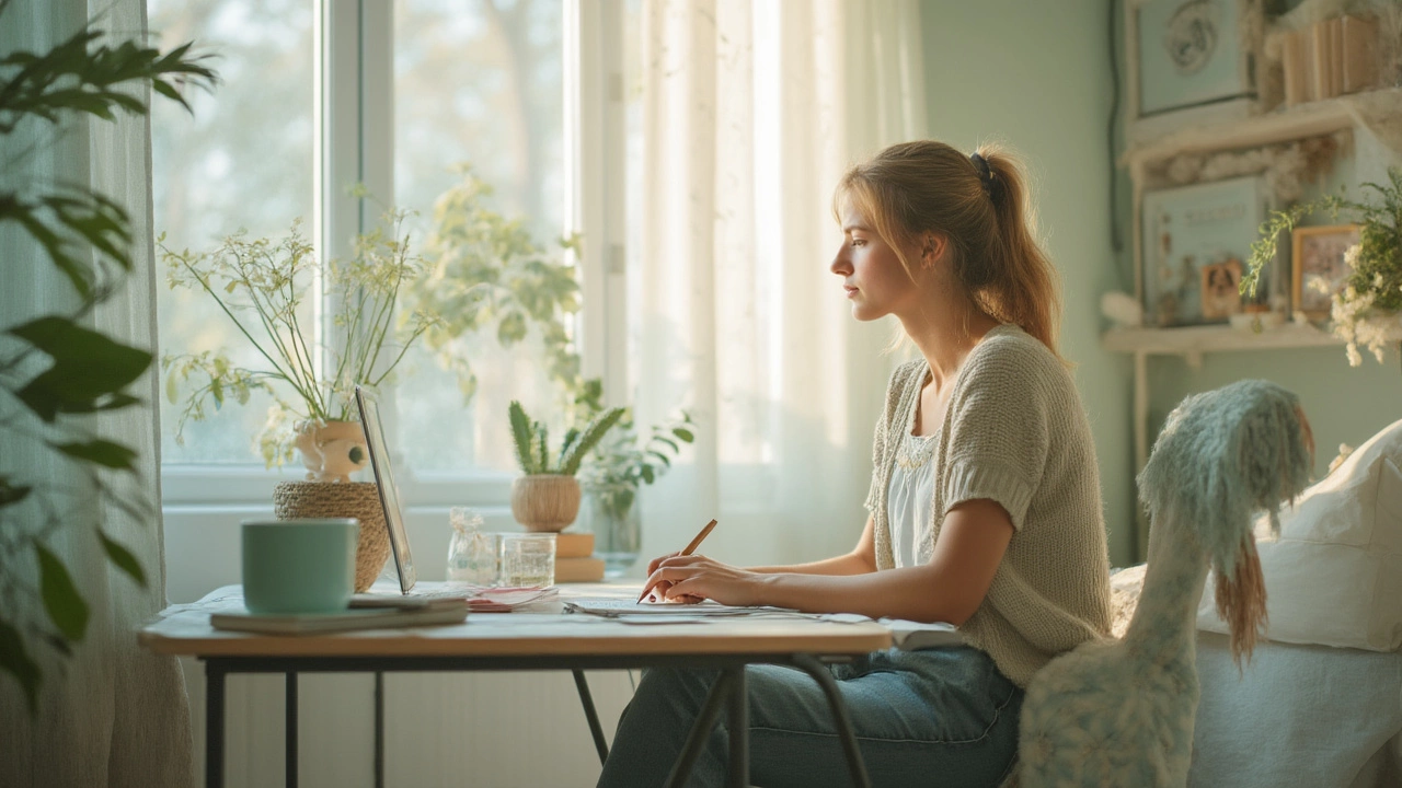
If you or someone you know lives with ADHD, you’ve probably tried timers, apps, and all kinds of tricks to stay on track. One tool most people overlook is color. The right shade on the walls, furniture, or even clothing can calm a racing brain and make it easier to concentrate.
Before you head to the paint aisle, it helps to know why color even matters. Our brains react to light wavelengths, and those reactions can change mood, alertness, and anxiety levels. For folks with ADHD, the goal is to pick colors that lower overstimulation without making the space feel dull.
Why Color Matters for ADHD
Research shows that cool tones – blues, greens, and soft purples – tend to lower heart rate and reduce stress. Those shades signal the nervous system to relax, which can curb impulsive urges and improve attention. Warm colors like bright reds or oranges increase energy, but they can also spike anxiety, especially for someone already prone to distraction.
That doesn’t mean you have to live in a sea of navy. The key is balance. A calming base color paired with vibrant accents lets you keep a lively vibe while still supporting focus. Think of it as setting the stage for a clear mind, then adding a splash of personality.
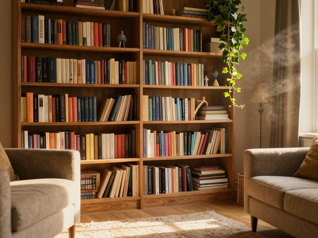
Top Colors to Try at Home
Soft Blue – Light blue feels like a clear sky. It lowers blood pressure and can make a room feel more spacious. Use it on walls in a home office or bedroom to create a soothing backdrop for work or sleep.
Muted Green – Green is linked to nature, which lowers cortisol (the stress hormone). A sage or pastel green works well in study areas or around a desk. Pair it with natural wood for an extra calming effect.
Lavender or Light Purple – These shades sit between blue and red on the spectrum, offering calm without feeling cold. A lavender accent wall or a purple rug can add a gentle lift without overwhelming the senses.
Warm Gray – If you’re not a fan of strong colors, warm gray delivers a neutral canvas that still feels comfy. It doesn’t compete with visual processing, letting the brain focus on tasks.
Accent Pops – Once you have a calming base, add small pops of brighter colors like mustard yellow or teal in accessories (cushions, lamps, art). The contrast keeps the environment interesting without flooding it with high‑energy hues.
Where you apply the color matters too. Paint the largest surfaces (walls, ceiling) with the calming hue. Keep furniture and flooring more neutral, and use accessories for the brighter accents. This layering approach prevents visual overload while still allowing personality.
Don’t forget lighting. Natural light amplifies the benefits of cool colors, while harsh fluorescent lights can mute them. If natural light is limited, choose bulbs with a soft white (3000–3500K) output to keep the room from feeling stark.
Finally, test before you commit. Paint a small section of wall or use removable wallpaper. Live with it for a few days and note any changes in focus or mood. If it feels right, go ahead and expand.
Choosing the best color for ADHD isn’t about picking a single “magic” shade. It’s about creating a balanced environment where calming tones set the stage and thoughtful accents keep things lively. With a little experimentation, you can turn any room into a space that supports concentration, reduces stress, and still looks great.
-
Quentin Melbourn

- 9 July 2025
Best Calming Colors for ADHD: How to Create a Peaceful Space
Discover what color is most calming for ADHD, why it works, and how you can use it to create a more peaceful, focused environment at home or work.