
The science of color is sneaky. Most people think picking a shade for your walls or a bedsheet is just about tastes and trends. But for folks living with ADHD, color choice isn’t just decoration—it can set the mood, help wind down, or crank the anxiety into overdrive. Imagine standing in a bright red room with buzzing lights and scattered toys everywhere. For me, that’s instant brain melt. If you’ve got ADHD or a loved one does, you’ve probably had that weird feeling of being overwhelmed in a space that looks totally normal to everyone else. It’s not in your head—your brain is wired to react to sensory input, and colors are a big part of that. Stick around, because I’m breaking down the exact shades that science and real-world experience say can make life with ADHD smoother (and what to avoid if you want a chill vibe).
How Color Affects Focus and Calm in ADHD
Let’s get this out of the way: yes, color really does have a noticeable impact for people with ADHD. There’s a reason schools paint classrooms in certain hues and not others. People with ADHD experience sensory input more intensely, and certain colors hit the brain like a bus. Red, for example, is shown in multiple studies to raise heart rate, blood pressure, and feelings of unrest. That doesn’t sound too bad for a basketball court, but it’s a nightmare for homework time. You know what else happens? Bright yellows and neons can trigger headaches or make it hard to concentrate. The brain craves something softer, less likely to trip the internal alarm bells.
On the flip side, soft, cool colors help tamp down the brain’s excitement. This isn’t just theory. A study out of Curtin University found that kids with ADHD performed better on cognitive tasks in a room painted light blue compared to yellow or red. Blue’s not just easy on the eyes. It interacts with the part of your nervous system that encourages calm and focus—kind of like a visual blanket for the mind. Another experiment had adults with ADHD choose between different colored objects when feeling stressed. Most picked blue or green items, saying those made them feel more at ease.
But why does this work the way it does? The answer goes back to how our eyes and brains interpret light waves. Longer wavelengths—think red and orange—fire up the part of the brain related to energy and alertness. Shorter wavelengths—blue and green shades—are linked to calming, stress-reducing feelings. This is why hospital scrubs come in light greens and blues, not hot pink. Even animals in high-stress environments tend to be calmer around these colors; it’s probably baked into our DNA somewhere.
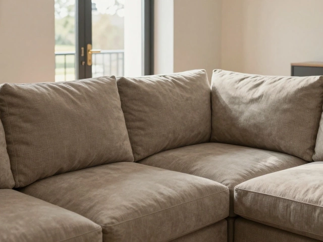
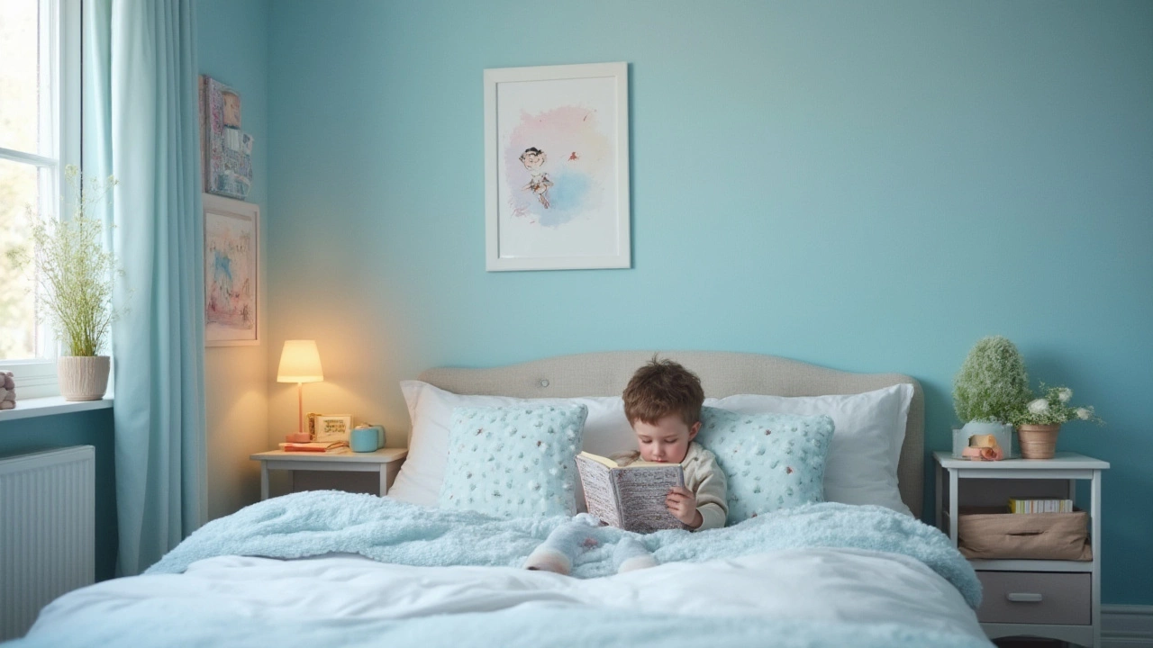
It gets more interesting, though. Not all blues or greens are created equal. Deep navy might be elegant, but it can feel cold or too heavy. Neon turquoise? That’s just another hyperactive color in disguise. The sweet spot is soft, muted, almost dusty-looking shades—think sky blue, sage green, or a gentle aqua. Serena and I once swapped the blinding white bulbs in the kitchen for a mix of soft blue and green LED lights. Instantly, the space went from frantic breakfast chaos to something I could stand in at 7am without wanting to run outside. That’s the effect you want—something subtle enough to fade into the background but present just enough to take the edge off busy thoughts.
If you’ve got kids with ADHD, try grabbing some paint samples and letting them weigh in, but steer them toward choices in those calming families. There’s also research showing natural materials, like wood or stones with blue and green tinting, have the same effect. Add in a few houseplants (seriously, any excuse for more plants), and you’ve got a recipe for chill.
The Ultimate Calm: Which Shades Really Work?
Alright, let’s get to the part you probably scrolled for: what color is actually best for calming ADHD? If you need just one answer, it’s overwhelmingly blue. Pale blues—imagine the clear sky early in the day or sea glass—regularly come out on top in studies measuring stress, mood, and focus for people with ADHD. These colors lower heart rate, slow breathing, and signal the brain’s internal brakes. Blue is sometimes called the world’s favorite color, but it’s especially powerful for brains that run at full speed.
Don’t stop with blue, though. Green deserves a spot right next door. Green is connected with nature, growth, and quiet. People with ADHD often benefit from spending time outside—nature itself is therapy. Research from the University of Illinois showed that just viewing images of gardens or forests improved attention and reduced impulsivity in kids with ADHD. So if you can’t drag a whole tree into the living room, painting a wall a soft green (think celery or pale sage) is the next best thing.
Want some practical color choices for different rooms? Here’s a quick cheat sheet:
- Bedrooms: Soft blue, pastel green, lavender (but only the paler shades).
- Living rooms: Light teal, sage green, or even a super soft gray with blue undertones.
- Study spaces: Pale aqua, airy blue, soft mint green.
Lighting matters, too. You could have the perfect paint, but if you blast it with harsh LED white, you’re not doing yourself any favors. Go for bulbs labeled as “warm” or “daylight” instead of “cool white.” If you want to get really fancy, smart bulbs that shift color are awesome. Serena loves tinkering with ours, switching to blueish tones whenever she’s working on something stressful. It can make more of a difference than fancy furniture or expensive gadgets.
If you’re a renter or staring down white walls you can’t paint, fabric and accessories are your friends. Think blue or green throws, rugs, storage bins, and even art prints. I’ve thrown a blue blanket over an ugly office chair and instantly cut the sense of chaos in my work-from-home setup. Even changing out pillow covers or using soft, natural curtains can give your room the right feel without scaring your landlord. For families, let your ADHD kid pick their own calm spot with a blue beanbag or a green reading nook—a sense of ownership makes the color even more effective.
If you want to experiment, try keeping a short diary over a week: note how you feel in different rooms, and any times you felt more or less relaxed or distracted. Then, swap in a new rug or a colored lamp. Give it a few days and see if your brain (or your child’s) notices a shift. I did this last winter and realized that our old living room rug—a bold geometric in orange and red—was secretly putting everyone on edge. Swapping it for a powder-blue version? Total game changer.

Common Mistakes and Tips for Making Color Work with ADHD
Picking the right color isn’t just about slapping some paint on the wall. There are plenty of ways people get this wrong, and it can actually make ADHD symptoms worse. First up: avoid loud, saturated colors. That means putting away anything that looks like it belongs on a racecar or in a candy commercial. Deep reds, bright oranges, electric yellows—they spark the brain’s alert system and can amp up impulsiveness. Even if your favorite team’s color is neon green, the living room really doesn’t need to look like a sports bar.
Mistake number two is mixing too many colors, even if they’re technically “calming.” Ever step into a nursery full of pastel blue, lavender, seafoam, and yellow checks? It can turn into a jumble that’s too much for a sensitive brain. Stick to one or two main colors and use neutrals like soft gray or cream to keep it grounded. This approach also gives your eyes a place to rest. Remember, the goal is less visual noise, not a big box of crayons exploded in your space.
A lot of folks try to use soft pinks or purples, guessing they must be relaxing. The science is mixed. Pale pink (like the famous “Baker-Miller Pink” used in some prisons to calm aggression) has results that are all over the place with ADHD. Some people find it works; others end up feeling irritated or sleepy. Purples are trickier—too dark, and they become heavy; too bright, and they tip back toward the distracting side.
Don’t forget that texture and patterns matter as well. If a calming color is used for loud prints or wild florals, it can still trigger sensory overload. Go for solids or subtle, simple patterns if you’re trying to tamp down visual chaos. This goes for bedding, curtains, rugs—almost everything. Even picture frames can get in the act. Swap those gaudy neons for soft blue or green frames if you’re DIY-inclined. Minimal fuss makes for maximum peace.
Here are my favorite quick-fire tips for using color to support anyone with ADHD:
- Use soft blue or green zones for relaxing activities—naps, reading, quiet play.
- If screens are part of daily life (tablets, TVs, computers), set “night mode” or blue-light filters to dial down harsh blues in the evening.
- Break up big blocks of a single color with natural textures—wood, soft yarns, baskets, plants.
- Try color-coding storage bins or folders with gentle blue and green hues for routine tasks.
- Hang up calming nature-inspired art in bedrooms and study spaces.
Last thing—your color scheme only works if you’re comfortable in it. Even within blue or green, everyone has an ideal shade. My spouse can’t stand anything that looks remotely “grayish,” while I grew up with a Robin’s-egg-blue bedroom and still swear by it for sleep. If bright colors make you genuinely happy or energize you in the right way, make them work as small pops—in a lamp base or a photo frame, for example.
The real trick is paying attention to how spaces make you feel, and tweaking them until things start to click. Calming colors for ADHD aren’t magic, but they’re a smart, practical part of making home a place your brain wants to be. Next time you’re thinking about that renovation or just freshening up your workspace, don’t just leave color up to chance. Your brain, and maybe your whole family, will silently thank you for swapping out the stress for a bit of blue or green calm.