ADHD and Colors: How Hues Can Help or Hinder Focus
Ever notice how a bright yellow wall makes you feel restless while a soft blue one feels soothing? That’s not just a feeling – it’s how colors interact with the brain, especially for anyone with ADHD. The right shades can calm a racing mind, and the wrong ones can add to the noise. Below are simple ways to use color to make daily life easier.
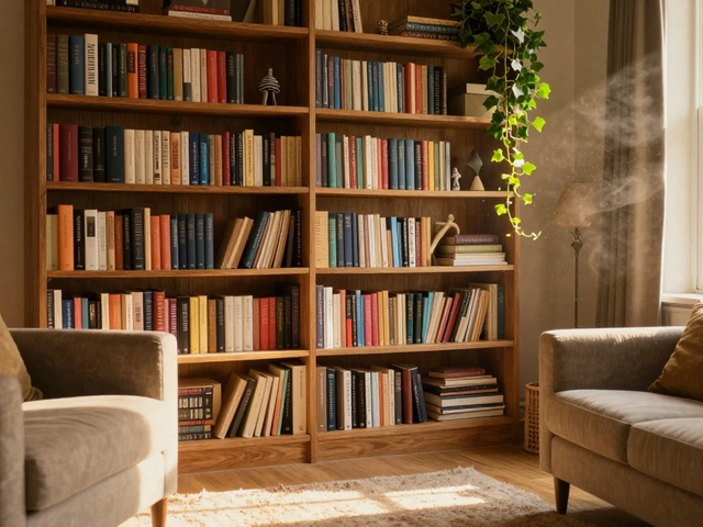
Colors That Support Concentration
Research shows that cool, muted tones help the brain stay on task. Light blue, gentle green, and soft gray are the top picks. These colors lower visual clutter and reduce the urge to fidget. If you’re setting up a study area, paint the walls or add accessories in these shades. A plain blue desk lamp or a green desk mat can be enough to notice a steadier focus.
Another useful hue is pastel yellow. While bright yellow can be too stimulating, a muted pastel version adds a hint of optimism without the overload. Use it sparingly – a small accent wall or a few yellow cushions can lift mood without distracting.
Colors to Keep Out of Work Zones
Red, orange, and vivid pink are great for energizing spaces like gyms or playrooms, but they can be a problem when you need to concentrate. These warm colors trigger the brain’s alert system, which can make it harder to settle into a task. If you love the vibrancy, keep those colors to a minimum in work zones. A red picture frame or an orange coffee mug is fine, but avoid painting whole walls in those shades.
Fluorescent lighting combined with bright colors can also cause visual fatigue. If you can’t change the wall color, use neutral furniture and add soft, diffused lighting to balance the environment.
Practical Tips for Applying Color at Home
Start small. Swap out a bright lamp shade for a cooler one, or add a teal rug to a study corner. These changes cost little but can shift the room’s vibe instantly.
For bedroom redesigns, think about calming shades to support better sleep – a light lavender or dove gray works well. Since many people with ADHD struggle with bedtime routines, a soothing color can make the space feel more restful.
If you’re redecorating a whole room, paint the larger walls in a neutral cool tone and use stronger colors for accessories. This keeps the overall feel calm while still letting your personality shine through.
Finally, test it out. Spend a few days in the newly colored space and notice how your focus and mood change. If a color feels too stimulating, swap it for a softer version. The goal is a space that helps you stay on track without feeling boxed in.
Colors are a simple tool you can control. By choosing the right hues for work, study, and rest areas, you give your brain the environment it needs to thrive. Give these tweaks a try and see how a little change can make a big difference.

-
Quentin Melbourn

- 9 July 2025
Best Calming Colors for ADHD: How to Create a Peaceful Space
Discover what color is most calming for ADHD, why it works, and how you can use it to create a more peaceful, focused environment at home or work.