Furniture Color Guide: Pick the Right Shades for Your Home
When working with Furniture Color Guide, a step‑by‑step method for matching paints, fabrics and finishes to your décor. Also known as color palette planning, it helps you avoid clashing tones and creates harmony across rooms. Furniture Color Guide encompasses Neutral Colors, soft hues like beige, taupe and ivory that blend with most styles, Gray Paint Shades, light to medium greys that can enlarge a space or set a calm mood and bold accent tones that add personality. Understanding light, material and room function enables smarter color choices.
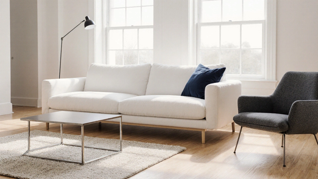
Why Neutral Colors Matter
Neutral colors act as the canvas for any furniture arrangement. Because they don’t dominate, they let you switch out accessories without a full repaint. A sofa in a warm ivory or a wardrobe in soft taupe can pair with both modern art and classic prints. The guide shows how to test a swatch against natural light and artificial fixtures, ensuring the hue stays consistent from morning to night. When you layer textures—like linen cushions on a leather chair—neutral backs provide visual balance without overwhelming the eye.
Gray paint shades are a close cousin of neutrals but bring a cooler vibe. Light gray walls can make a modest bedroom feel larger, while medium greys add depth to living rooms with large windows. The guide explains how undertones—blue, green or warm pink—react with different flooring and ceiling colors. Knowing that a blue‑based gray pairs well with stainless steel fixtures saves you from costly repainting later.
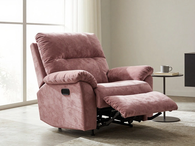
Bold accent colors are the spice that prevents a room from feeling bland. A deep teal accent wall behind a bed, a mustard‑yellow chair in a study, or a crimson rug in a hallway can become focal points. The guide walks you through the 60‑30‑10 rule: 60% dominant color (usually neutral), 30% secondary color (often a complementary hue), and 10% accent (the bold pop). Applying this rule ensures the accent feels intentional rather than random.
Material finish also influences perceived color. A matte wood finish reflects less light than a glossy lacquer, making the same paint appear richer. Upholstery fabrics like velvet absorb more light than cotton, deepening the shade. The guide lists common finishes—matte, satin, semi‑gloss, high‑gloss—and tells you which works best with each color family, so you avoid mismatched sheen that can look cheap.
Room function drives color choice, too. Bedrooms benefit from calming shades that encourage relaxation; think muted grays or soft neutrals. Kitchens often favor brighter tones that stimulate appetite and energy, such as warm whites or light greys. Home offices need focus‑enhancing hues like muted blues or greens. The guide matches each major room with a palette that supports its primary activity, helping you pick colors that work beyond aesthetics.
Personal style is the final piece of the puzzle. Whether you lean modern, rustic, coastal or eclectic, the guide helps translate that vibe into a color language. It offers quick style quizzes, visual mood boards and real‑world examples from East Yorkshire homes, showing how a coastal palette of sea‑foam green and sand‑beige differs from a rustic scheme of olive drab and weathered oak.
All these insights combine into a practical toolkit you can use right now. Below you’ll find articles that dive deeper into each aspect—neutral couch colors, gray paint tricks, accent ideas and more—so you can start planning your perfect furniture color story today.
-
Quentin Melbourn

- 25 October 2025
Timeless Furniture Colors: A Complete Guide to Ever‑Green Shades
Discover the most timeless furniture colors, how to use them, and maintenance tips to keep your pieces looking fresh for years.
Popular Posts


Categories
Tag Clouds