Bookcase Balance & Scale Calculator
📚Left Side Items
🏺Right Side Items
Balance Visualization
📏Negative Space Calculator
🎯Scale Proportion Checker
💡 Design Tips Based on Your Setup:
- Start adding items to receive personalized styling tips
Ever walked into a room that felt... off? Maybe the sofa looked tiny against the wall, or a lamp seemed to be fighting for space on a side table. It’s not just bad luck; it’s usually a violation of the golden rule in interior design. While decorators love to debate specific trends, one principle stands above the rest: balance. Specifically, achieving visual equilibrium through proper scale and proportion.
When you’re dealing with large vertical pieces like bookcases, this rule isn’t just advice-it’s the difference between a cozy library and a cluttered storage closet. Getting this right transforms how your entire home feels, breathing life into spaces that might otherwise feel heavy or chaotic. Let’s break down exactly what this means for your shelves and how to apply it without needing a degree in architecture.
Understanding Visual Weight and Balance
Balance doesn’t mean symmetry. You don’t need identical items on both sides of a bookcase to make it look good. In fact, strict symmetry can sometimes feel sterile or museum-like. The golden rule is about distributing visual weight-the perceived heaviness of an object based on its size, color, texture, and complexity.
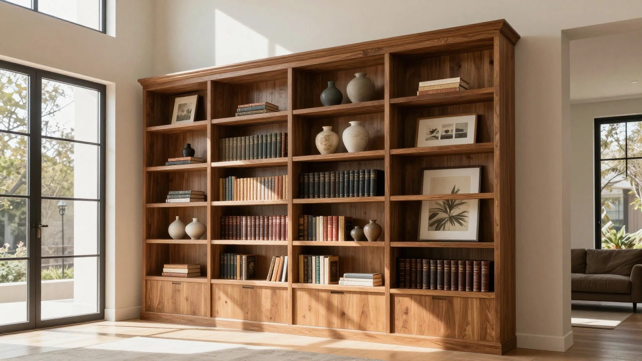
Think of your bookcase as a seesaw. A massive, dark leather-bound encyclopedia set on the bottom left shelf has significant visual weight. If you leave the bottom right shelf completely empty, the eye will drag to the left, making the whole piece feel unstable. To counteract this, you don’t necessarily need another heavy book. You might place a cluster of three medium-sized ceramic vases or a framed piece of art leaning against the back panel. The key is that the feeling of weight matches, even if the physical objects are different.
This concept applies vertically too. Heavy, dark items should generally sit lower on the shelves, while lighter, airier items belong higher up. This grounds the piece and prevents it from looking top-heavy, which is a common mistake when styling tall units.
The Critical Role of Scale and Proportion
Closely tied to balance is scale. This is where many people go wrong with bookcases. They buy a unit that looks great online but overwhelms their living room, or they choose something so small it disappears into the background. The golden rule dictates that furniture must relate harmoniously to the room it occupies.
If you have high ceilings and large windows, a floor-to-ceiling bookcase works beautifully. It anchors the space. But put that same giant unit in a compact apartment with low ceilings, and it will feel oppressive. Conversely, a petite, narrow bookshelf in a sprawling open-plan area will look lost and insignificant.
To get the scale right, measure your wall space first. As a general heuristic, your bookcase should occupy no more than two-thirds of the wall width it sits against. This leaves breathing room on either side, preventing the "boxed-in" feeling. Also, consider the height relative to other furniture. If your sofa is low-profile, a towering bookcase behind it might block sightlines and create a barrier rather than a connection.
Styling Shelves: Less Is Often More
Once the piece is in place, how do you style it? The golden rule here is restraint. Empty space is a design element. Crowding every inch of shelf space with books, knick-knacks, and photos creates visual noise that makes the room feel smaller and messier than it is.
- The Rule of Three: Group items in odd numbers, particularly threes. A single vase looks lonely; two vases look like a pair (which is fine, but less dynamic); three vases of varying heights create a natural rhythm and interest.
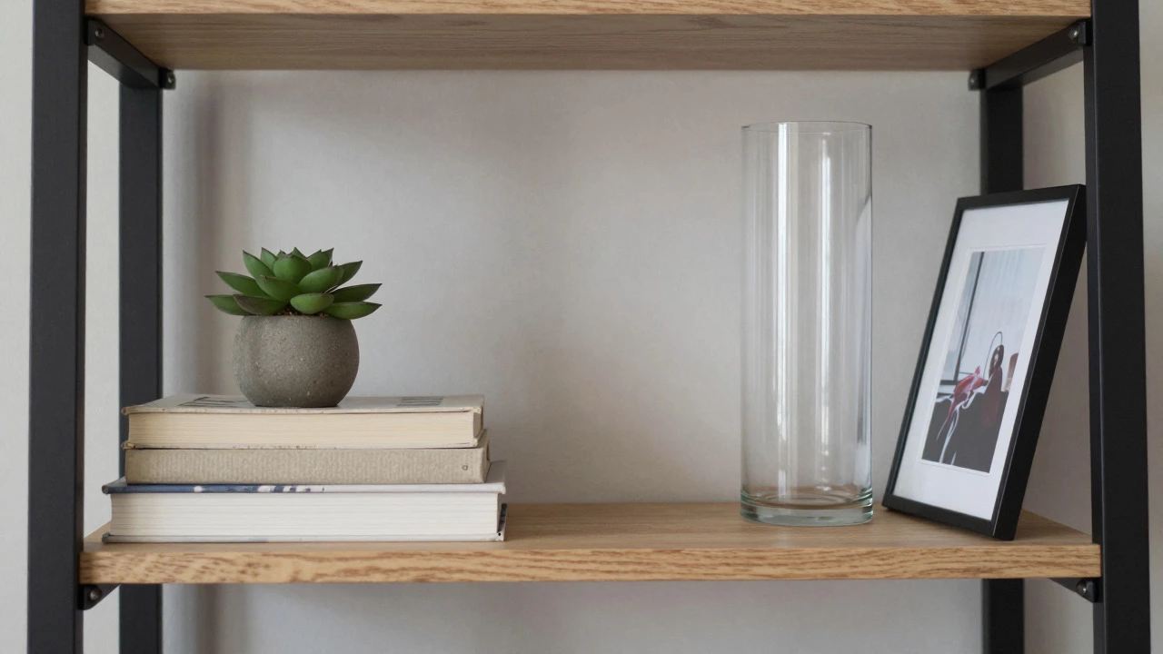
- Vary Heights: Avoid lining up all your books at the exact same height. Mix horizontal stacks with vertical rows. Place a small plant or sculpture on top of a horizontal stack to add verticality.
- Create Negative Space: Leave at least 20-30% of each shelf empty. This allows the eye to rest and highlights the items you’ve chosen to display. It’s the difference between a curated gallery and a hoarder’s attic.
Texture also plays a huge role in balancing styled shelves. Smooth glass, rough wood, soft fabric, and metallic accents all carry different amounts of visual weight. A mix of textures adds depth and prevents the display from looking flat or monotonous.
Color and Light: Influencing Perception
Color affects how we perceive weight and size. Dark colors recede and feel heavier; light colors advance and feel lighter. If you have a dark-stained wooden bookcase, styling it with only black books will make it look like a solid, imposing block. Introducing white spines, light-colored ceramics, or bright artwork breaks up that mass and makes the unit feel more integrated into the room.
Lighting is another tool for manipulating balance. A well-placed LED strip inside the bookcase or a nearby floor lamp can highlight specific shelves, drawing the eye upward and creating focal points. This helps distribute attention evenly across the piece, reinforcing the sense of balance. Without adequate lighting, corners of the bookcase can become shadowy voids, disrupting the visual flow.
Practical Application: Common Mistakes to Avoid
Even seasoned designers slip up occasionally. Here are some frequent errors that violate the golden rule of balance and scale:
- Ignoring the Room’s Architecture: Placing a wide bookcase in front of a window blocks natural light and disrupts the room’s inherent balance. Always consider architectural features like doors, windows, and fireplaces when positioning large furniture.
- Over-Accessorizing: Adding too many small decorative items creates clutter. Each item should have a purpose or bring joy. If you’re unsure whether to keep something, try removing it and stepping back. If the shelf looks better, leave it out.
- Neglecting Vertical Lines: Using only short, squat items on shelves can make a tall bookcase look stubby. Incorporate tall plants, standing frames, or stacked books to emphasize the height and elegance of the piece.
- Mismatched Styles: Mixing ultra-modern minimalist decor with rustic farmhouse-style books can create dissonance. Aim for a cohesive aesthetic that ties the contents of the bookcase to the rest of the room’s design language.
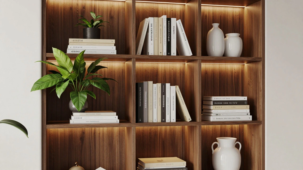
Choosing the Right Bookcase for Your Space
Not all bookcases are created equal. Some are designed primarily for storage, while others serve as statement pieces. Understanding the type of bookcase you need helps you adhere to the golden rule from the start.
| Type | Best For | Visual Weight | Balancing Tip |
|---|---|---|---|
| Floor-to-Ceiling | High ceilings, large rooms | High | Use light colors and sparse styling to reduce bulk. |
| Modular/Ladder | Small spaces, apartments | Low | Anchor with a rug or nearby chair to prevent floating look. |
| Built-In | Custom fit, seamless integration | Variable | Match trim and paint to walls for a unified appearance. |
| Glass-Front | Displaying collectibles, formal settings | Medium | Ensure internal lighting to avoid dark, heavy boxes. |
For most homes, a modular or ladder-style bookcase offers flexibility. These units often have open backs and slender profiles, which reduces their visual weight significantly. They allow light to pass through, maintaining the openness of the room. When styling these, focus on asymmetrical balance-perhaps a large potted plant on one side and a few stacked books on the other-to keep things interesting without overwhelming the space.
Integrating Functionality with Aesthetics
A beautiful bookcase is useless if it doesn’t work for your lifestyle. The golden rule extends to functionality: form follows function. If you have a large collection of novels, prioritize shelving depth and sturdiness. If you’re displaying photography or art, look for adjustable shelves and good lighting options.
Consider how you interact with the space. Do you read in the evening? Position the bookcase near a comfortable chair with accessible lighting. Is it a high-traffic area? Ensure the shelves aren’t protruding too far into the walkway. Practical considerations influence placement, which in turn affects the overall balance of the room. A bookcase placed awkwardly can disrupt the flow of movement, creating a subconscious sense of imbalance.
Also, think about maintenance. Open shelves gather dust quickly. If you dislike cleaning, closed cabinets or glass-fronted units might be a better choice, even if they carry slightly more visual weight. The ease of upkeep contributes to long-term satisfaction with your design choices.
Final Thoughts on Mastering the Golden Rule
Mastering the golden rule of interior design-balance through scale and proportion-isn’t about following rigid formulas. It’s about developing an eye for harmony. Start by assessing your room’s dimensions and existing furniture. Choose a bookcase that fits comfortably within those boundaries. Then, style it with intention, leaving room for breath and movement.
Experiment. Move things around. Step back frequently to see the big picture. Over time, you’ll develop an intuition for what feels right. Your home should reflect your personality while providing a comfortable, visually pleasing environment. By respecting the principles of balance and scale, you ensure that every piece, especially prominent ones like bookcases, contributes positively to that goal.
What is the absolute golden rule in interior design?
The core golden rule is achieving visual balance through proper scale and proportion. This means ensuring that furniture and decor elements feel stable and harmonious within the space, neither overwhelming nor disappearing into the background.
How do I balance a bookcase without using symmetrical items?
Focus on visual weight rather than identical shapes. Pair a heavy item on one side with a group of smaller, lighter items on the other. Use varying heights, textures, and colors to create equilibrium that feels natural and dynamic rather than rigid.
Should my bookcase touch the ceiling?
It depends on your ceiling height and room size. Floor-to-ceiling bookcases work well in rooms with high ceilings and large footprints, adding grandeur. In smaller rooms or those with standard 8-foot ceilings, leaving some gap above the unit prevents it from feeling oppressive.
How much empty space should I leave on my shelves?
Aim to leave about 20-30% of each shelf empty. This negative space allows the eye to rest and prevents the display from looking cluttered. It highlights the items you’ve chosen to showcase and maintains a clean, organized aesthetic.
Does color affect the balance of a room?
Yes, significantly. Darker colors feel heavier and recede, while lighter colors feel lighter and advance. Using a mix of light and dark tones on your bookcase shelves helps distribute visual weight evenly and prevents any single section from dominating the view.
What is the best way to style a ladder bookcase?
Ladder bookcases are lightweight and open. Style them asymmetrically with a mix of vertical and horizontal items. Place taller plants or frames on lower rungs and smaller decor on upper ones. Keep the overall look airy to complement the structure’s delicate nature.
Can I use a bookcase as a room divider?
Yes, but choose a low-profile or open-back model to maintain light flow and visual connection between areas. Ensure the scale matches the room’s height and that the styling on both sides is balanced to avoid blocking views entirely.
How does lighting impact bookcase styling?
Lighting draws attention and adds depth. Internal LED strips or nearby lamps can highlight specific shelves, creating focal points and reducing shadows. Proper illumination ensures that the visual weight of displayed items is perceived correctly and enhances the overall balance.