When you’re installing built-in bookcases, one of the biggest decisions isn’t about wood type or shelf depth-it’s color. Should they match the walls? Or stand out? It’s not just about aesthetics. It’s about how the room feels, how light moves through it, and whether your books become a feature or disappear into the background.
Matching bookcases to walls creates a seamless look
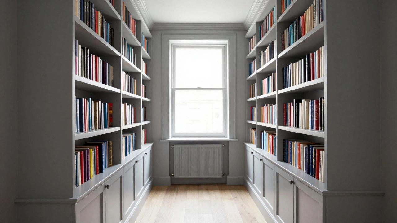
Painting built-in bookcases the same color as the walls is one of the oldest tricks in interior design-and for good reason. It makes the shelves feel like part of the architecture, not an add-on. Think of it like trim around a window: when it’s the same color as the wall, you don’t notice the edge. You notice the space.
In smaller rooms, this trick works wonders. A narrow living room with floor-to-ceiling bookcases painted white or soft gray will feel taller and more open. The shelves don’t compete with the walls-they blend. This is especially useful if you have a lot of clutter on the shelves. Matching colors help visually shrink the mess. A 2023 study by the Journal of Interior Design found that rooms with monochromatic built-ins were perceived as 15% more spacious by participants, even when square footage was identical.
It’s also easier to maintain. If your walls get touched up every few years, your bookcases stay in sync. No need to repaint shelves separately. Just roll the same paint on both.
Contrasting colors make bookcases a focal point
But what if you want your books to be seen? What if your collection is your art? Then matching the walls might be the wrong choice.
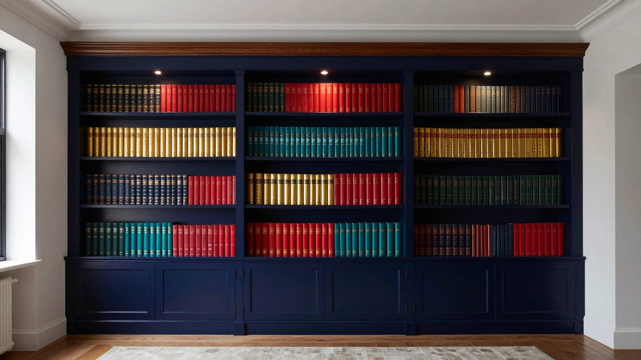
Painting your built-in bookcases a deep navy, charcoal, or even black turns them into a statement wall. It adds depth and drama. In a bright, minimalist room, that contrast creates visual weight. It’s like a painting on the wall-but functional. You’re not hiding your books. You’re showcasing them.
Dark bookcases work especially well with light walls. Think of a cream-colored living room with navy built-ins. The books become a gallery. The contrast draws the eye. It’s a move used by designers in New York lofts and London townhouses. It’s not trendy-it’s timeless.
And if you’ve got colorful spines? A dark background makes them pop. Red, gold, teal, mustard-all of them glow against a black or charcoal shelf. You don’t need to organize by color. The contrast does the work for you.
What about trim and molding?
Most built-in bookcases come with crown molding, baseboards, or frame details. Here’s where things get tricky. If your walls and bookcases match, should the trim match too?
Yes-usually. Keeping trim the same color as the walls and shelves creates a unified, clean line. If your trim is white but your bookcase is sage green, you’ll get visual noise. The eye jumps between the trim and the shelf. It breaks the flow.
There’s one exception: if your trim is ornate and you want to highlight it. In that case, paint the trim a slightly lighter or darker shade than the bookcase. It adds dimension without clashing. But don’t go full white if the rest is dark. That’s a recipe for confusion.
Lighting changes everything
Color isn’t just about paint swatches. It’s about how light hits it.
If your bookcase sits in a room with lots of natural light, a matching wall color will look soft and calm. But in a dim corner? That same color might vanish. Your books become hard to see. You’ll find yourself squinting to read titles.
On the flip side, a dark bookcase in a poorly lit room can feel heavy. It swallows light. That’s why many designers recommend a mid-tone gray or warm taupe for north-facing rooms. It’s neutral enough to blend, but dark enough to hold visual weight.
Always test paint on the actual shelves. Paint a 2x2 foot section. Live with it for three days. Watch how it looks at 8 a.m., noon, and 7 p.m. Light changes everything.
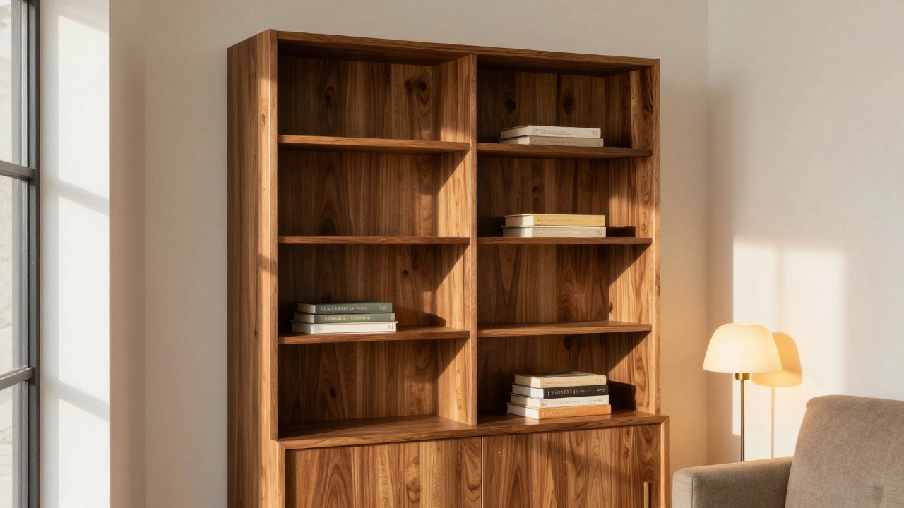
What about wood finishes?
If your bookcases are made of real wood-not painted MDF-you’re working with a different set of rules.
Stained wood doesn’t blend the same way painted surfaces do. A walnut bookcase against a white wall creates warmth. A light oak bookcase against a dark gray wall feels modern. You don’t need to match. You need to complement.
Here’s a simple rule: if your wood is warm (reddish, golden), pair it with warm wall tones-beige, cream, soft yellow. If your wood is cool (grayish, ashy), go with cool walls-greys, taupes, pale blue.
And if you’re unsure? Paint the trim white. It’s the universal neutral. It lets the wood shine without fighting the walls.
Real-world examples that work
Take a home in Portland where the living room walls are a muted sage. The built-in bookcases are painted the exact same shade. The result? A calm, cohesive space. The books are visible, but the shelves aren’t distracting. It feels like a library, not a storage unit.
Or look at a Chicago apartment with white walls and black bookcases. The contrast is bold. But because the shelves are tight to the wall and the books are neatly arranged, it doesn’t feel chaotic. It feels intentional. The black frames the books like a museum exhibit.
One client in Austin painted her bookcases a deep olive green. The walls were off-white. She didn’t think it would work. But after a month, she said, “I don’t look at the walls anymore. I look at the books.” That’s the goal.
When not to match
There are times when matching is a mistake.
If your walls are already busy-patterned wallpaper, textured plaster, or strong color-don’t add matching bookcases. You’ll overload the space. Let the shelves be a calm anchor.
If your bookcases are shallow or poorly built, matching them to the wall makes flaws obvious. You’ll see every gap, every crooked shelf. In those cases, a contrasting color can distract from imperfections.
And if you’re renting? Don’t paint. Use removable wallpaper on the back panel instead. Or stick with a neutral shelf color that works with any wall.
Final decision checklist
- Do you want the bookcase to disappear? Match the wall color.
- Do you want it to stand out? Go darker or bolder than the wall.
- Is the room small or dark? Stick to light, neutral tones.
- Do you have colorful books? Dark shelves make them pop.
- Is the trim detailed? Match the trim to the bookcase, not the wall.
- Is the wood natural? Complement, don’t match. Use tone, not hue.
What’s the most common mistake?
People paint the bookcase before testing it in the room. They pick a color they love on a swatch. Then they paint the whole thing. Two days later, they regret it.
Always test. Paint a small section. Live with it. Move your books around. Sit in the chair and look at it from different angles. Light changes color. Your mood changes how you see it.
And remember: this isn’t permanent. You can always repaint. But getting it right the first time saves time, money, and stress.
There’s no single right answer. But there’s a right answer for your space. Look at your books. Look at your walls. Look at your light. Then choose.
Should I paint my built-in bookcases the same color as my walls?
It depends on your goal. Matching creates a seamless, spacious feel and hides clutter. Contrasting makes the bookcase a design feature. If your room is small or you want calm, match the walls. If you want drama or to highlight your books, choose a darker or bolder color.
What color should I paint built-in bookcases if my walls are white?
You have two strong options. Paint them white too for a clean, airy look that makes the room feel larger. Or go dark-navy, charcoal, or black-to create a bold, gallery-like contrast. Avoid mid-tones like beige or gray unless you’re going for a very subtle, modern look. White walls with white shelves = minimal. White walls with dark shelves = dramatic.
Do built-in bookcases need to match the trim?
Yes, if you want a polished look. If your bookcase and walls match, paint the trim the same color. If your bookcase is a different color, match the trim to the bookcase. Mismatched trim creates visual clutter and breaks the flow. The only exception is if the trim is ornate and you want to highlight it-then use a slightly lighter or darker shade.
Can I paint built-in bookcases if they’re made of wood?
Yes, but it’s a bigger job. Sand the surface first, use a primer made for wood, and choose a paint with good coverage. If you love the wood grain, consider staining instead. Painting wood hides the grain. Staining enhances it. Both work-just know what you’re giving up.
What if I’m renting and can’t paint?
Use removable wallpaper on the back panel of the shelves. It’s an easy, non-damaging way to add color or pattern without painting. You can also use decorative baskets or fabric panels to soften the look. Stick to neutral shelves and let accessories do the talking.